
How to test Mobile Friendly Compatibility for your website
Category : On-page SEO
The mobile-friendly algorithm is a page-by-page signal, so it can take time for Google to assess each page, and that may be why it will be a gradual rollout. And depending on how fast Google crawls and indexes all of the pages on your site, the impact can be slow to show up.
It is believed that this rollout will have less impact than the original mobile-friendly update, which was called “Mobilegeddon,” which was supposed to have a significant impact on the mobile results, but not everyone said it had that much of an impact.
If you are not mobile-friendly, or if you want to ensure you are, check the Google mobile-friendly tool, and check Google’s mobile guidelines.

Here’s the guide
Does Your Website Pass the Mobile-Friendliness Test?
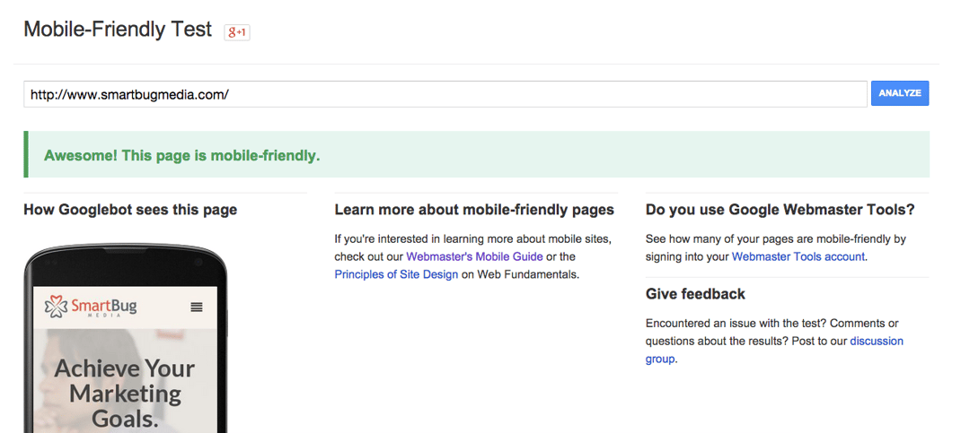
Google is making it simple for companies to test their website and ensure that you have a mobile-friendly site. They have created a tool called the “Mobile-Friendly Test” where you can type in your web address and see if you meet the new standard. When you pass the test, it looks something like this:
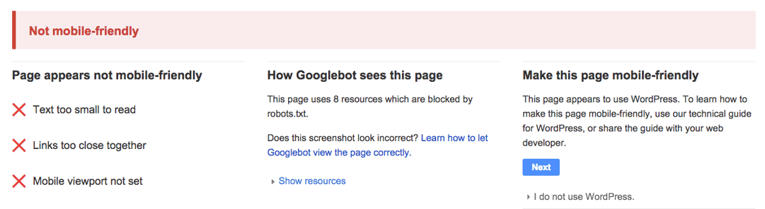
If you don’t pass the test Google will give you insights as to why it didn’t pass and will look something like this:
What Happens if You Don’t Pass?
If your site isn’t fully optimized for mobile devices, you will likely see a hit to your ranking on mobile searches. What that means is you need to have a mobile site up and running in the near term. Here’s where to start:
Decide How You Will Optimize for Mobile
There are several approaches for optimizing your site for mobile devices. Choose one of the following that works for you:
- Responsive Design – Responsive Design is the number one choice by Google for mobile optimization design patterns. Choosing responsive design is desirable because it only uses one URL for your site rather than a mobile URL and a desktop URL.
NOTE: If you’re already hosted on HubSpot’s COS then you’re optimized with responsive design. If you’re not already hosted on the COS but need to move to it now, - Dynamic Serving – Dynamic serving changes the HTML of your website while keeping the same URL. Instead of shrinking and optimizing one design, dynamic serving figures out what kind of device the user is experiencing your website with and changes up to code to show something different. This is a more complicated process, but offers an optimized result as well.
NOTE: This approach is known to be a lot more error-prone so beware before choosing this option. - Separate Mobile Website – When mobile optimized sites first started to come to light, this was the way to create them. Instead of using one URL, a mobile website is essentially a new website built for your company for mobile purposes. It’s onerous for Google though. It means that they have to crawl two websites and two versions of your content. If you already have this in place, make sure it works properly. If you’re considering this option, make sure the other two aren’t better fits first.
Read more What to know about Google Mobile Friendly Algorithm Update
_______________________________________________________________________________
Please contact us for seo service packages at TDHSEO.COM.
TDHSEO Team
Email: tdhseo@gmail.com
Skype: tdhseo
https://www.facebook.com/tdhseo
Thank you!