
What to know about Google Mobile Friendly Algorithm Update
Category : SEO News
One of the biggest worries about “mobilegeddon” was that Google was going to start ranking mobile-friendly websites higher on their search results pages, leaving non-mobile-friendly websites behind in the dust. This was expected to be particularly damaging to smaller businesses that didn’t have the resources to create a responsive website design or a separate mobile version of their website.
What Is Mobile Friendly
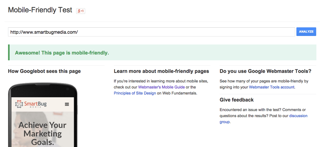
A web page is tagged eligible for ranking as mobile friendly if it meets the following criteria, as detected in real time by Googlebot.
- Avoids software that is not common on mobile devices
- Utilises text that can be read without zooming
- Sizes content to the screen so users don’t have to zoom or scroll horizontally
- Spaces links far enough apart so that the chosen one can be tapped easily
This isn’t exactly what the Google mobile-friendly algorithm update does. Yes, the algorithm does rank mobile-friendly websites higher now – but only for mobile searches, which – once you think about it – is completely logical.
Websites that doesn’t target mobile users – for example, websites that publishes long, in-depth research papers – aren’t going to be punished. Their ranking will remain the same for searches done via desktop or laptop. However, their ranking will drop for searches done on mobile devices. This won’t affect websites whose audiences aren’t searching for them on mobile devices.

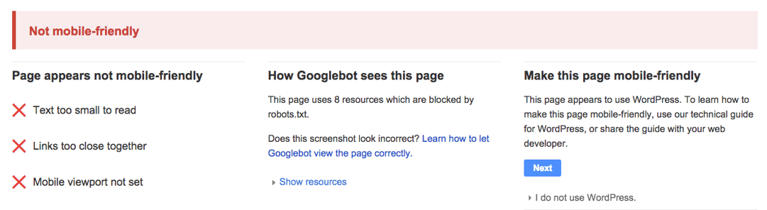
What Happens If Your Site Is Not Mobile Friendly?
If your site is not mobile friendly and is difficult to use on handheld devices then Google will penalise it and rank it lower on it’s mobile search results. To give publishers even more of an incentive to offer mobile friendly pages, Google announced that in May 2016 it will increase the importance of having mobile pages and that sites that are not mobile friendly will rank even lower than before.
Google stated that when it first introduced this as a ranking criteria last year, the premise was to give mobile users a better search experience. Most publishers and site owners have taken heed of this notification and developed their sites accordingly.
It is without doubt that mobile searches are now a high proportion of traffic on any site and will only increase in volume. It will only be a matter of time before mobile use overtakes any other type of search and it will be imperative for the success of any site that it is mobile friendly.
If your website is not optimised for mobile devices it will no longer appear in the top Google search results for mobile, meaning low visibility from mobile users and a reduction in overall website traffic. With 25% of all searches coming from mobile devices this loss in traffic could seriously limit the opportunities you have to reach and engage your potential customers. To ensure you’re still seen, consider optimising your website with a responsive design solution. Responsive design allows you to build or retro fit one core web solution, which then adapts based on the device being used, whether it is desktop, mobile or tablet. It is the ultimate in usability, enabling you to deliver content from one source to users on any device. With mobile browsing only set to increase and Google now taking action to accommodate this shift businesses would be wise to follow suit
How it impacts on
The update will impact search results in two key ways:
1. More mobile-friendly results will display in search.
2. More relevant app content will display in search results.
Previous updates have pushed towards mobile compliance by encouraging sites to be correctly configured and accessible via modern devices. As over half of all search is already conducted via mobile, and with the continued rise of smartwatches and tablets, mobile compliance has never been more important.
Read more How to test Mobile Friendly Compatibility for your website
_______________________________________________________________________________
Please contact us for seo service packages at TDHSEO.COM.
TDHSEO Team
Email: tdhseo@gmail.com
Skype: tdhseo
https://www.facebook.com/tdhseo
Thank you!

